Design Ideas·14 min read
Wedding Website Design Ideas: 15 Beautiful Styles to Inspire You
Explore 15 wedding website design ideas, from minimalist to boho, with colour palettes, font pairings and pages guests need. Find your style today.
By Aurelia Editorial Team · Wedding stationery & planning guides
Published
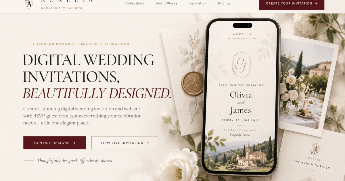
Your wedding website is often the first real look guests get at your celebration, right after the save the date arrives. Below are 15 wedding website styles, each with a ready-to-use colour palette with HEX codes, a free Google Fonts pairing and the one detail that makes the style work. Where Aurelia has wedding website templates in that style, we have linked them so you can try the look straight away.
What makes a great wedding website design?
A great wedding website design looks like your wedding and works for your guests. It uses a colour palette and fonts that match your invitation, opens with a strong photo, keeps the structure simple and keeps the RSVP within reach on any phone.
- A strong first screen: your names, the date, the place and one great photo, visible without scrolling.
- A consistent colour palette: two or three main colours plus one accent, taken from your venue, flowers or stationery.
- Readable fonts: a decorative font for names and headings, a clean font for everything else.
- A clear structure: story, schedule, venues and maps, travel, gifts, RSVP and FAQs. Our wedding website checklist covers every section.
- A phone-friendly RSVP: most guests open the link on their phone, so the form must be easy to complete with one thumb.
15 wedding website design ideas and styles
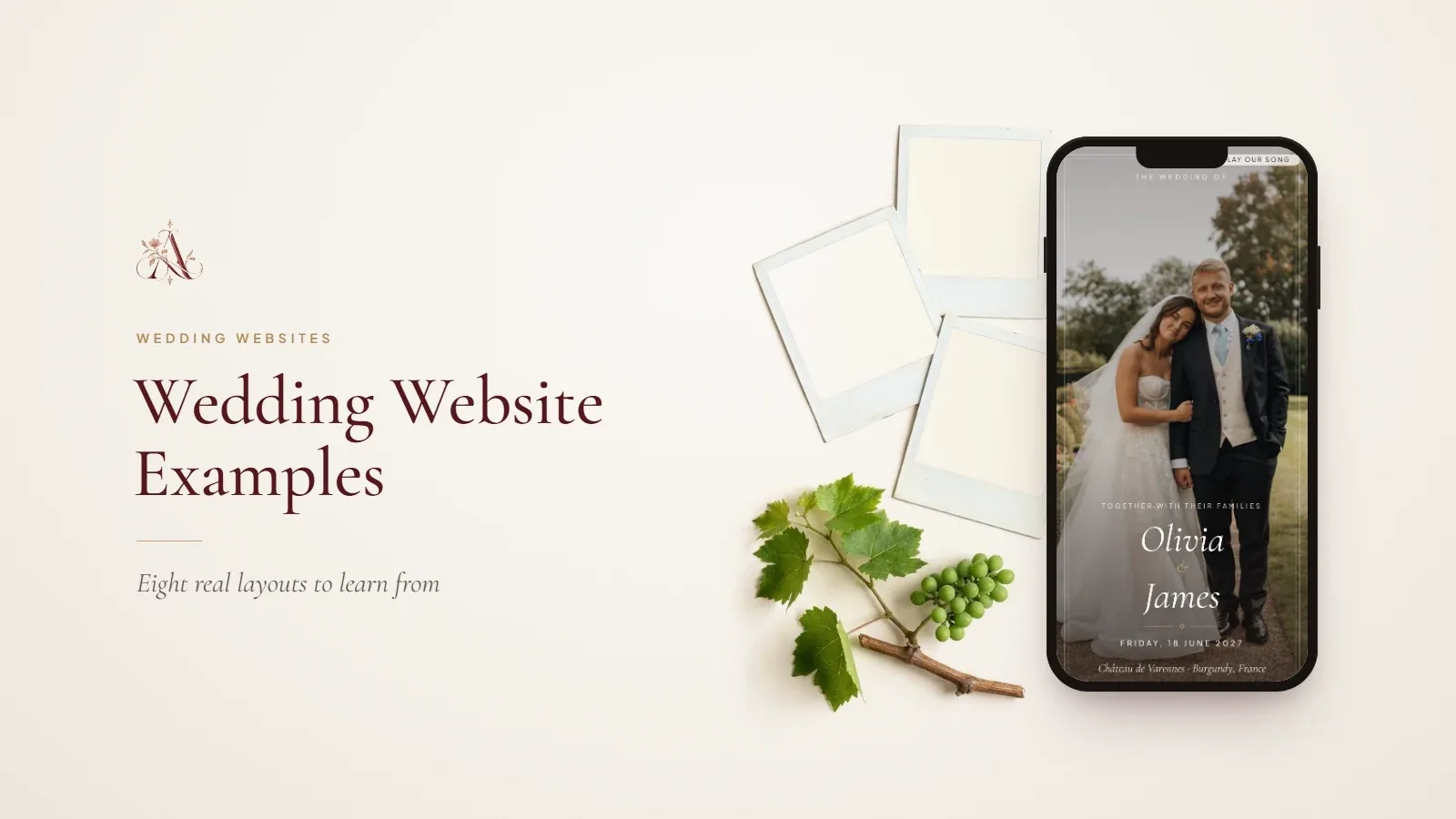
These wedding website ideas run from black-tie ballrooms to barefoot beach ceremonies. For each style you will find who it suits, a starter palette, a font pairing and its signature detail. To see how complete layouts come together, open our wedding website examples as a guest.
1. Minimalist and modern
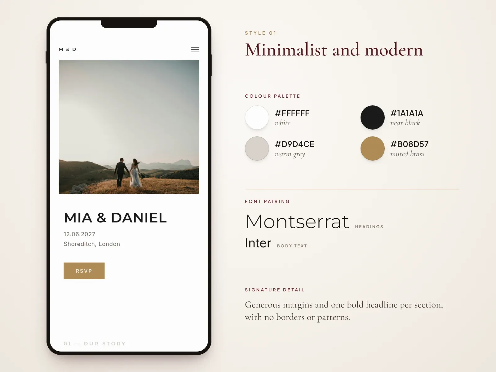
Minimalist wedding websites rely on white space, a single large photo and very little decoration. They suit city weddings, gallery or loft venues and couples who prefer “less, but better”.
- Best for: city, register office and modern venue weddings.
- Colour palette: #FFFFFF (white), #1A1A1A (near black), #D9D4CE (warm grey), #B08D57 (muted brass accent).
- Font pairing: Montserrat for headings, Inter for body text.
- Signature detail: generous margins and one bold headline per section, with no borders or background patterns.
- Try it: minimalist wedding templates.
2. Classic and elegant
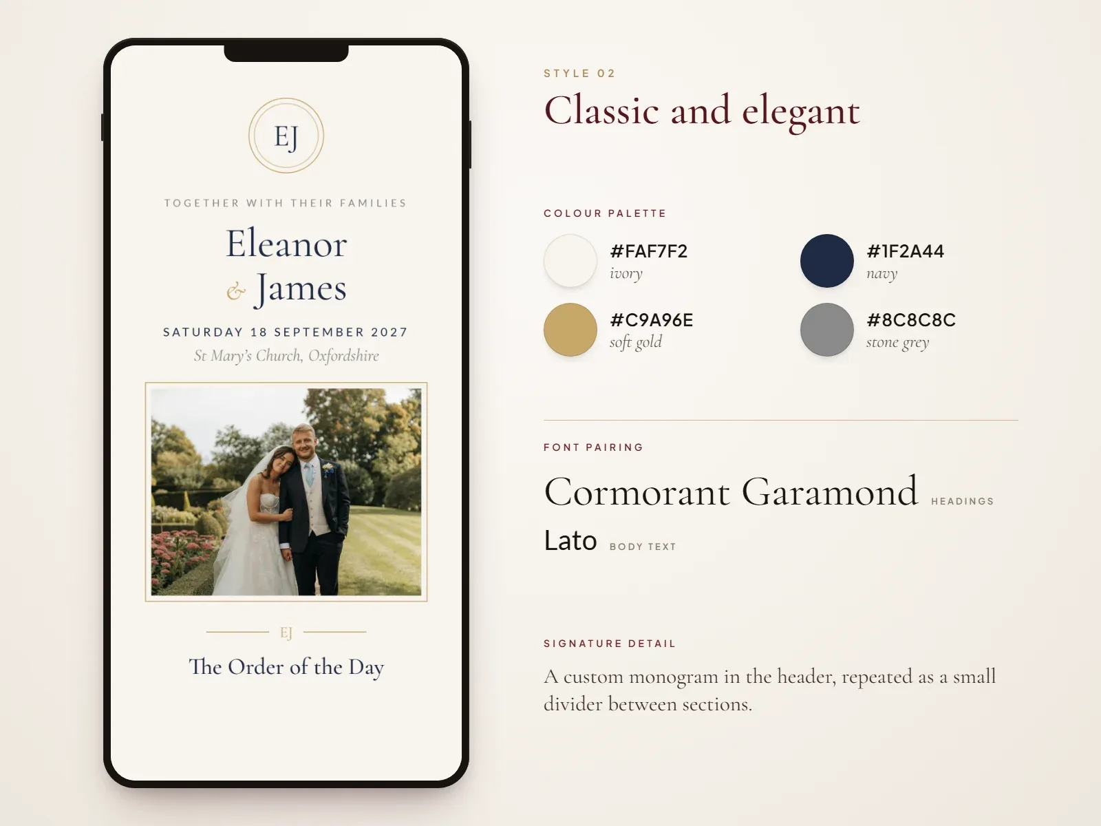
A classic wedding website feels timeless: centred layouts, serif type and a monogram that echoes your formal invitation suite. It is the sophisticated choice that never looks dated, even years later.
- Best for: church ceremonies, country houses and black-tie receptions.
- Colour palette: #FAF7F2 (ivory), #1F2A44 (navy), #C9A96E (soft gold), #8C8C8C (stone grey).
- Font pairing: Cormorant Garamond for headings, Lato for body text.
- Signature detail: a custom monogram in the header, repeated as a small divider between sections.
3. Romantic floral
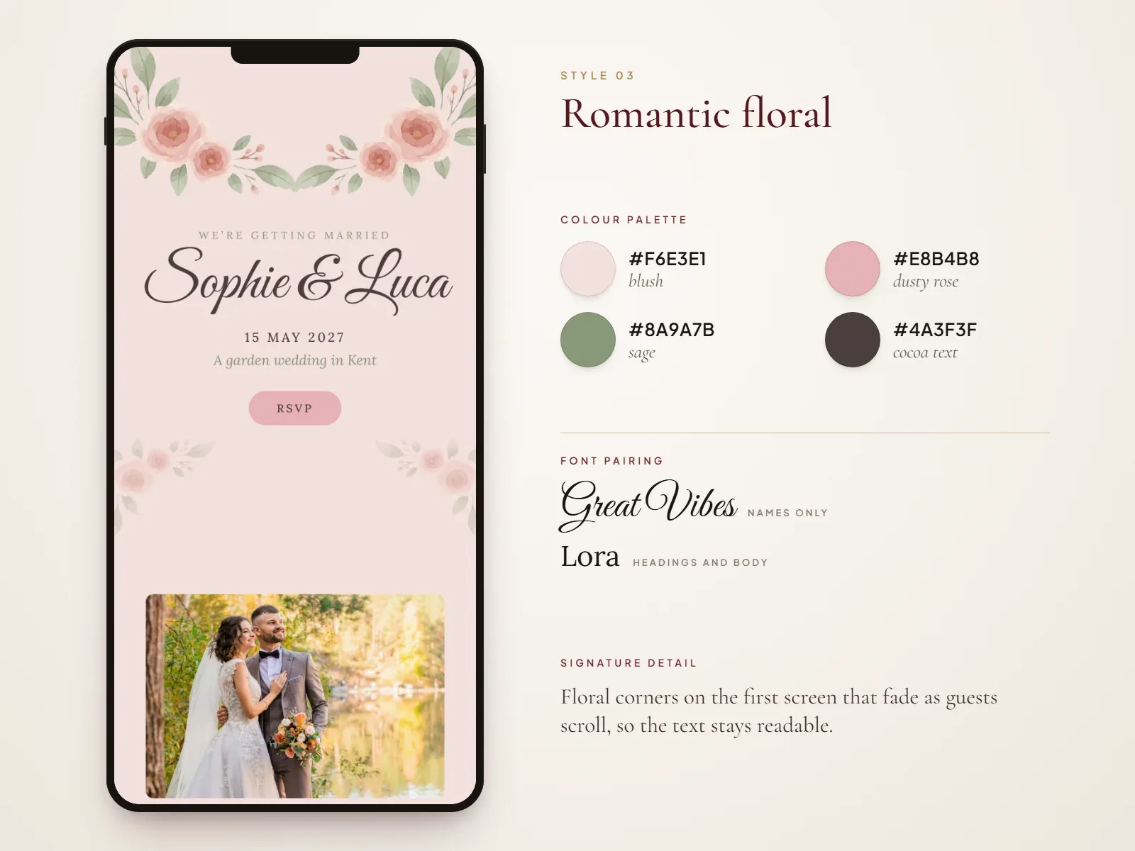
Romantic floral designs frame the page with painted or photographed blooms, usually peonies, garden roses or ranunculus. The look is soft and dreamy, and it pairs naturally with floral invitations.
- Best for: spring weddings, garden venues and romantic themes.
- Colour palette: #F6E3E1 (blush), #E8B4B8 (dusty rose), #8A9A7B (sage), #4A3F3F (cocoa text).
- Font pairing: Great Vibes for your names only, Lora for headings and body text.
- Signature detail: floral corners on the first screen that fade as guests scroll, so the text stays readable.
- Try it: floral wedding templates and romantic wedding templates.
4. Garden and botanical
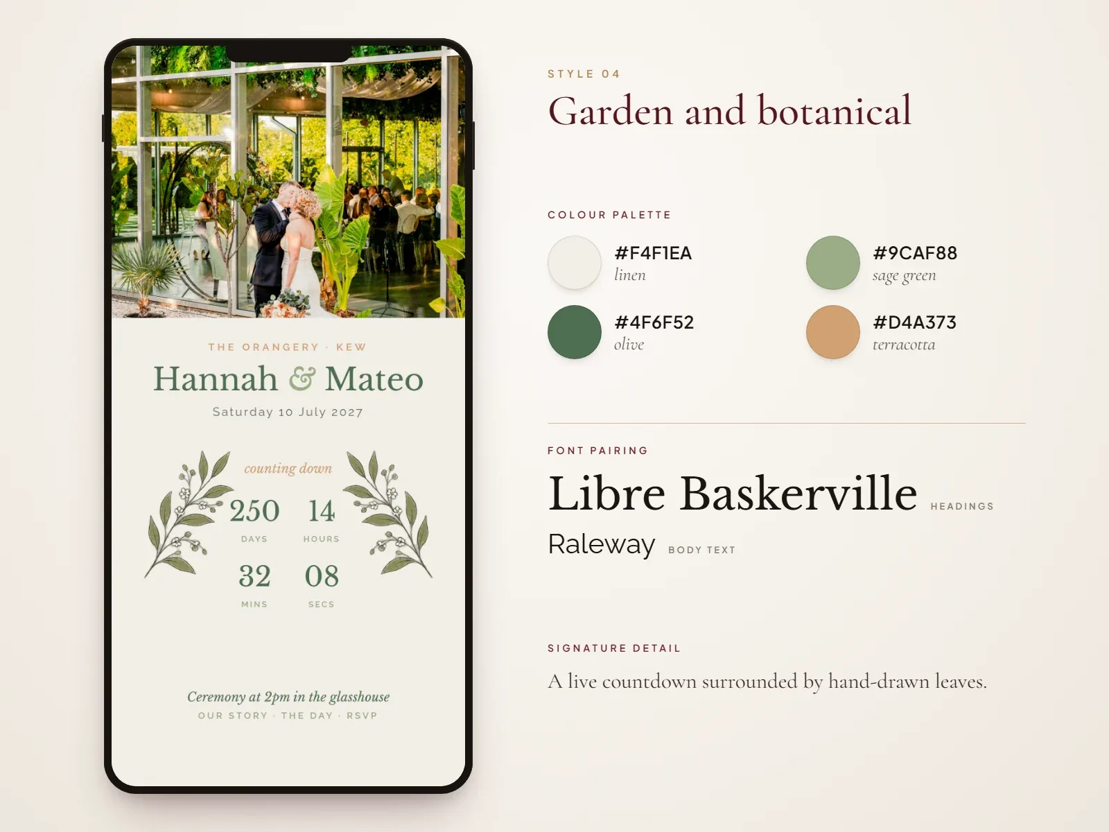
Botanical wedding websites swap flowers for greenery: eucalyptus, olive branches, ferns and trailing ivy. The result feels fresh and organic, and works for both relaxed and formal outdoor weddings.
- Best for: outdoor ceremonies, vineyards, orangeries and glasshouses.
- Colour palette: #F4F1EA (linen), #9CAF88 (sage green), #4F6F52 (olive), #D4A373 (terracotta accent).
- Font pairing: Libre Baskerville for headings, Raleway for body text.
- Signature detail: a live countdown surrounded by hand-drawn leaves.
5. Boho chic
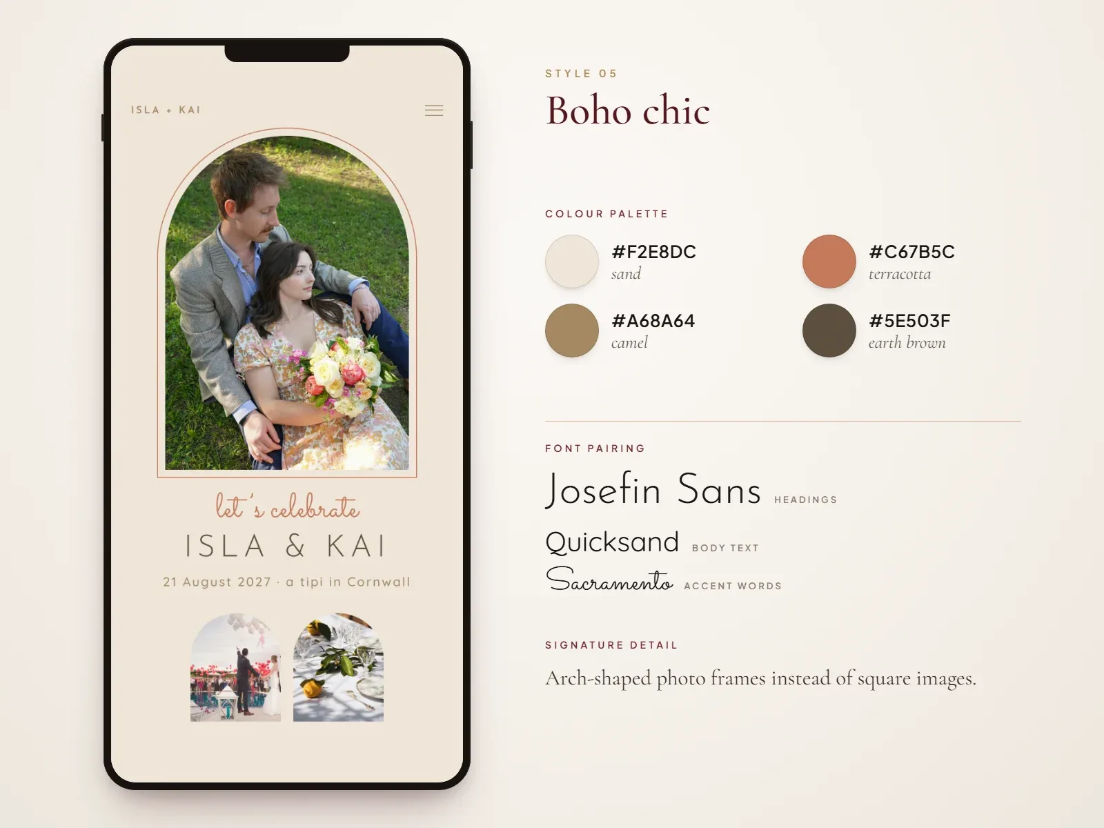
Boho wedding websites are warm, relaxed and full of texture. Think arch-shaped photo frames, pampas grass, dried flowers and sun-faded earth tones. They suit couples who want their wedding to feel like a festival with friends.
- Best for: festival-style, tipi, elopement and back-garden weddings.
- Colour palette: #F2E8DC (sand), #C67B5C (terracotta), #A68A64 (camel), #5E503F (earth brown).
- Font pairing: Josefin Sans for headings, Quicksand for body text, with Sacramento for accent words.
- Signature detail: arch-shaped photo frames instead of square images.
6. Rustic barn
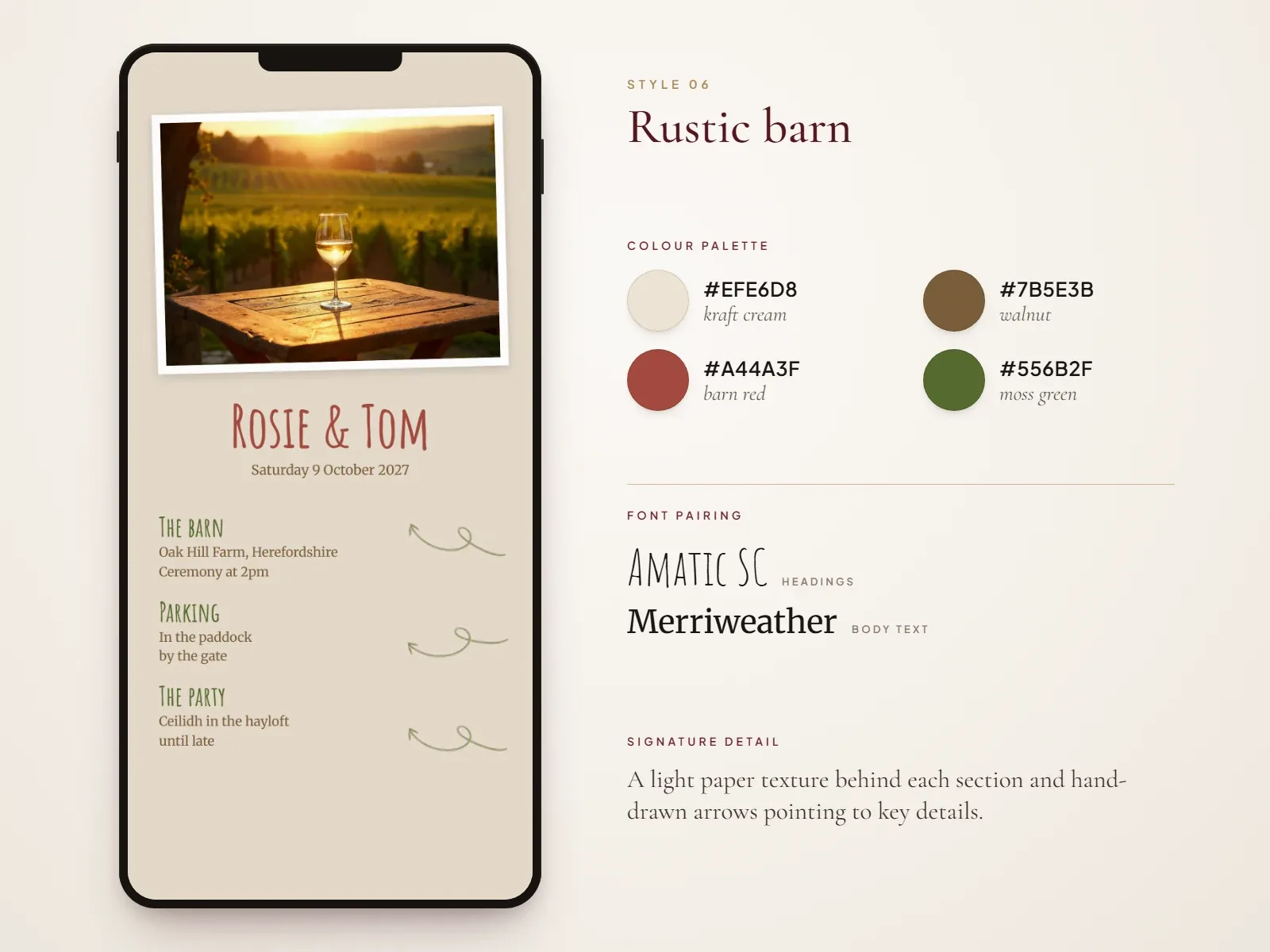
Rustic designs borrow from the venue itself: wood grain, kraft paper, festoon lights and wildflowers in jam jars. Keep textures subtle in the background so the words still read cleanly on a small screen.
- Best for: barns, farms, countryside and autumn weddings.
- Colour palette: #EFE6D8 (kraft cream), #7B5E3B (walnut), #A44A3F (barn red), #556B2F (moss green).
- Font pairing: Amatic SC for headings, Merriweather for body text.
- Signature detail: a light paper texture behind each section and hand-drawn arrows pointing to key details.
7. Tropical and beach
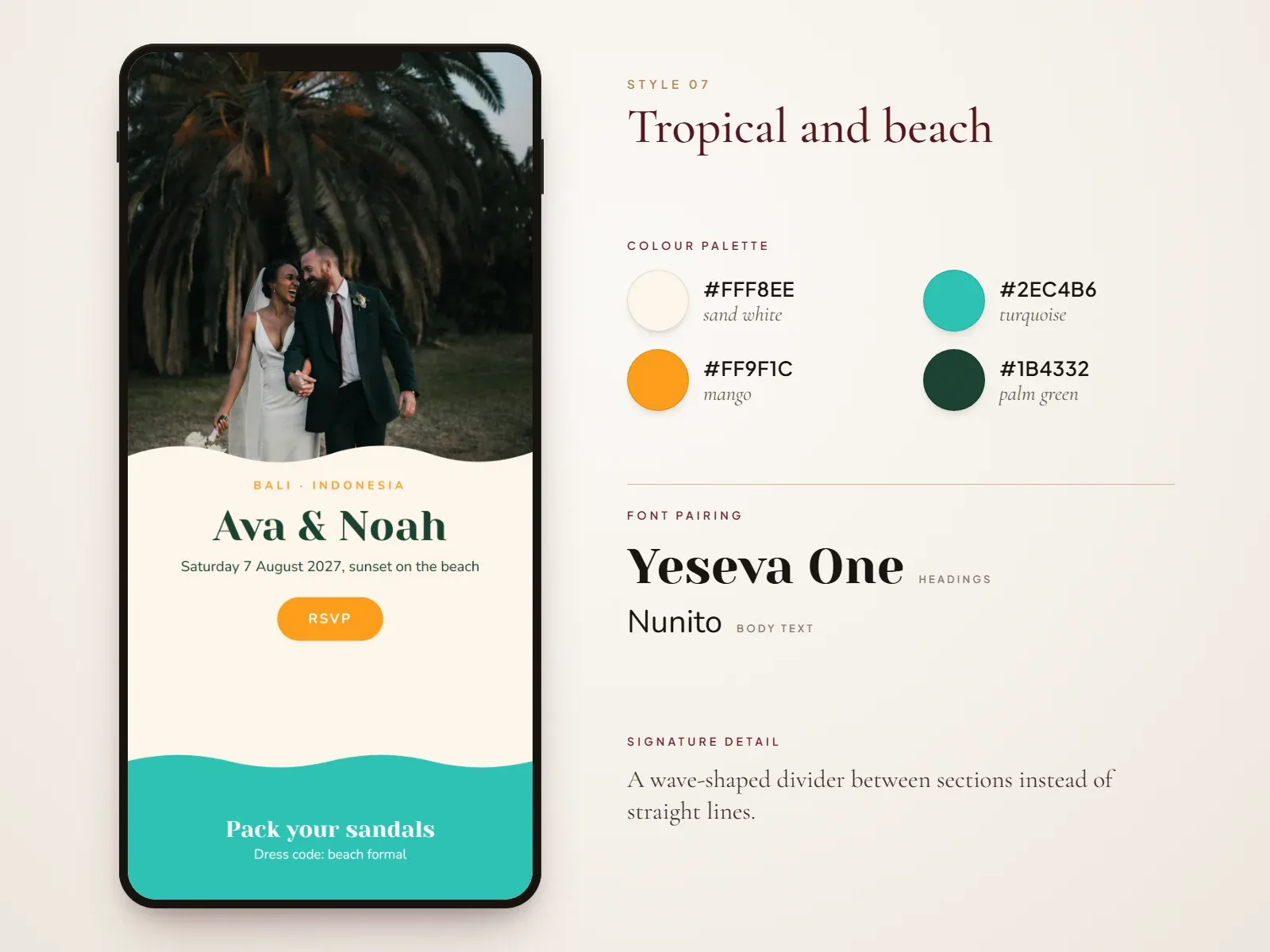
Tropical wedding websites use bright, saturated colour, palm leaves and ocean photography. They tell guests to pack sandals before they read a word, and they work best with a breezy, open layout.
- Best for: beach, island and summer weddings abroad.
- Colour palette: #FFF8EE (sand white), #2EC4B6 (turquoise), #FF9F1C (mango), #1B4332 (palm green).
- Font pairing: Yeseva One for headings, Nunito for body text.
- Signature detail: a wave-shaped divider between sections instead of straight lines.
8. Destination travel hub
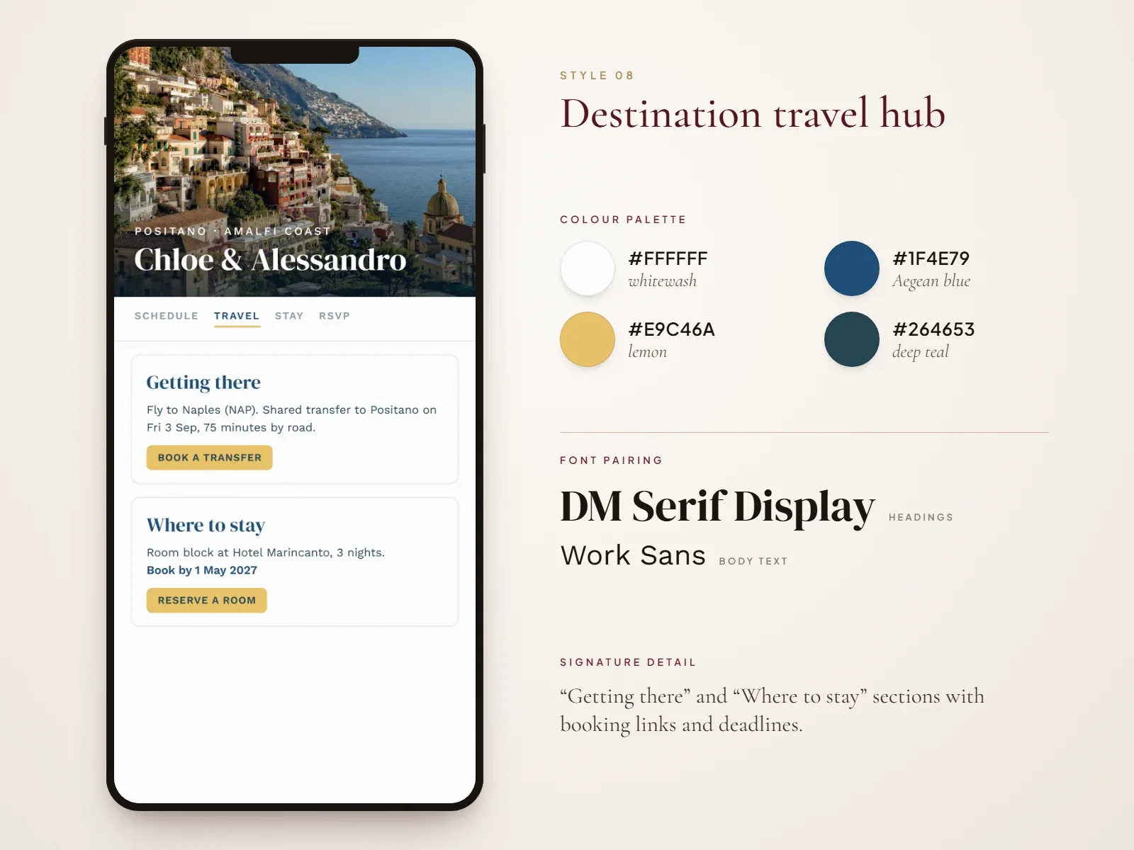
A destination wedding website is more than a pretty page: it is a travel guide. Design it around the practical details, with a map, airport and transfer information, hotel room blocks, local tips and a multi-day schedule. Take your colours from the place itself, such as the blues of the Amalfi Coast or the warm ochres of Provence.
- Best for: weddings abroad and multi-day celebrations.
- Colour palette (Mediterranean example): #FFFFFF (whitewash), #1F4E79 (Aegean blue), #E9C46A (lemon), #264653 (deep teal).
- Font pairing: DM Serif Display for headings, Work Sans for body text.
- Signature detail: “Getting there” and “Where to stay” sections with booking links and deadlines.
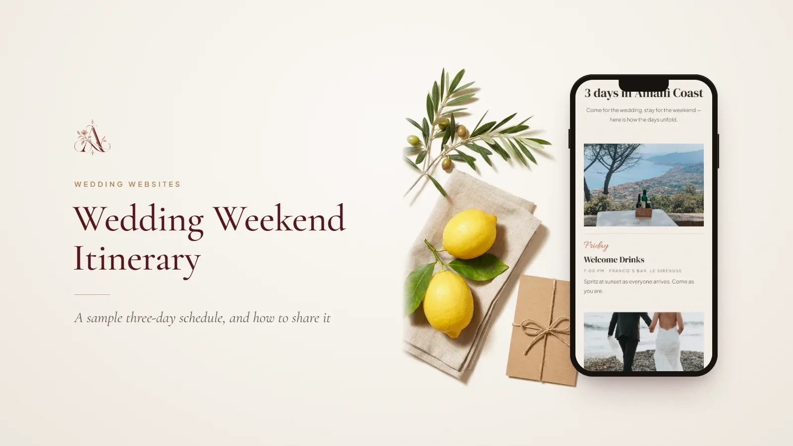
- Try it: destination wedding templates, then plan the days with our wedding weekend itinerary guide.
Found a style you like? Every Aurelia template includes your story, schedule, venue maps, gallery and a built-in RSVP, shared with one link. Browse the templates, design for free and pay only when you publish.
9. Vintage and retro
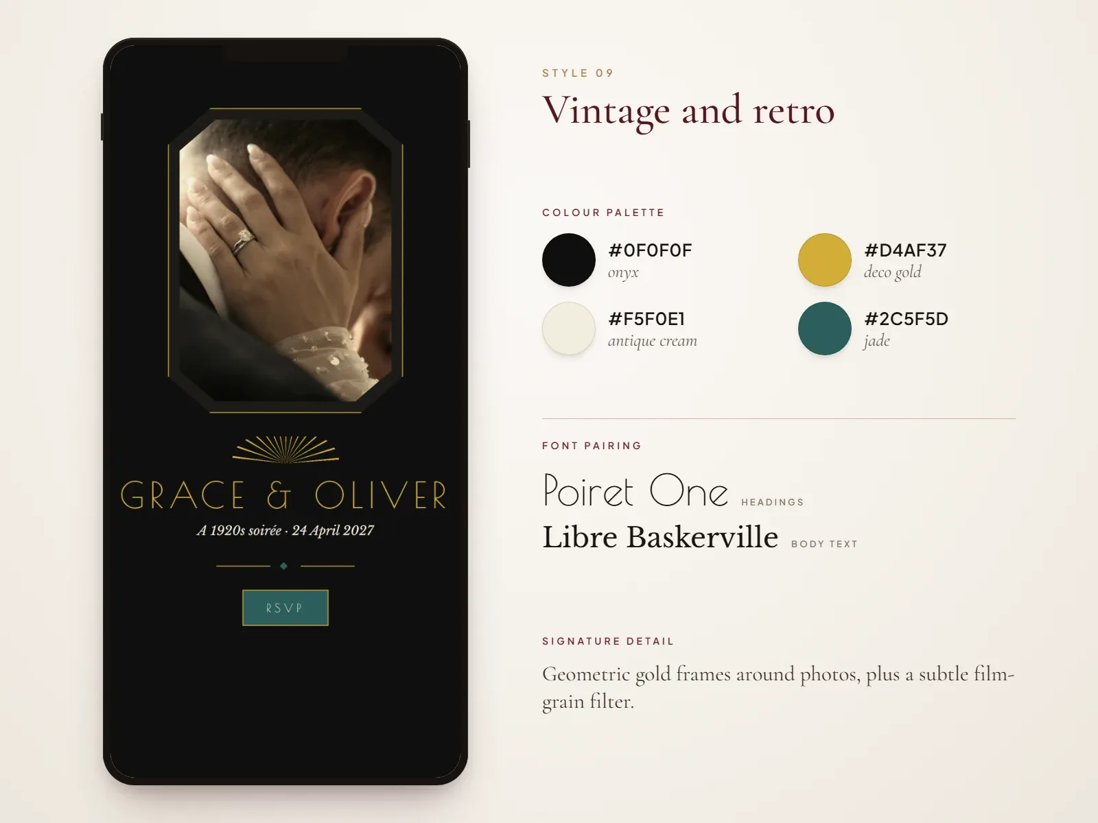
Vintage wedding websites lean into a specific era: 1920s art deco, 1960s mod or 1970s groovy. Pick one decade and commit to it across colours, fonts and photo filters so the theme reads clearly.
- Best for: historic venues, themed weddings and couples who love old films.
- Colour palette (art deco example): #0F0F0F (onyx), #D4AF37 (deco gold), #F5F0E1 (antique cream), #2C5F5D (jade).
- Font pairing: Poiret One for headings, Libre Baskerville for body text.
- Signature detail: geometric gold frames around photos, plus a subtle film-grain filter.
- Try it: vintage wedding templates.
10. Black and white
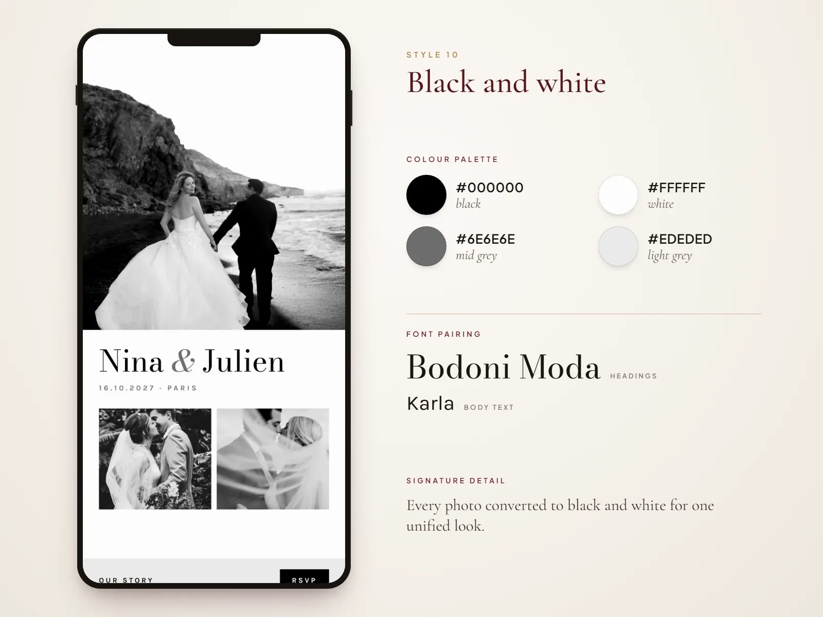
Monochrome wedding websites use only black, white and grey, which makes your photos the hero. Black-and-white portraits look editorial and timeless, and the high contrast keeps every line easy to read.
- Best for: formal city weddings and couples with strong engagement photos.
- Colour palette: #000000 (black), #FFFFFF (white), #6E6E6E (mid grey), #EDEDED (light grey).
- Font pairing: Bodoni Moda for headings, Karla for body text.
- Signature detail: every photo converted to black and white for one unified look.
11. Luxury gold and glamour
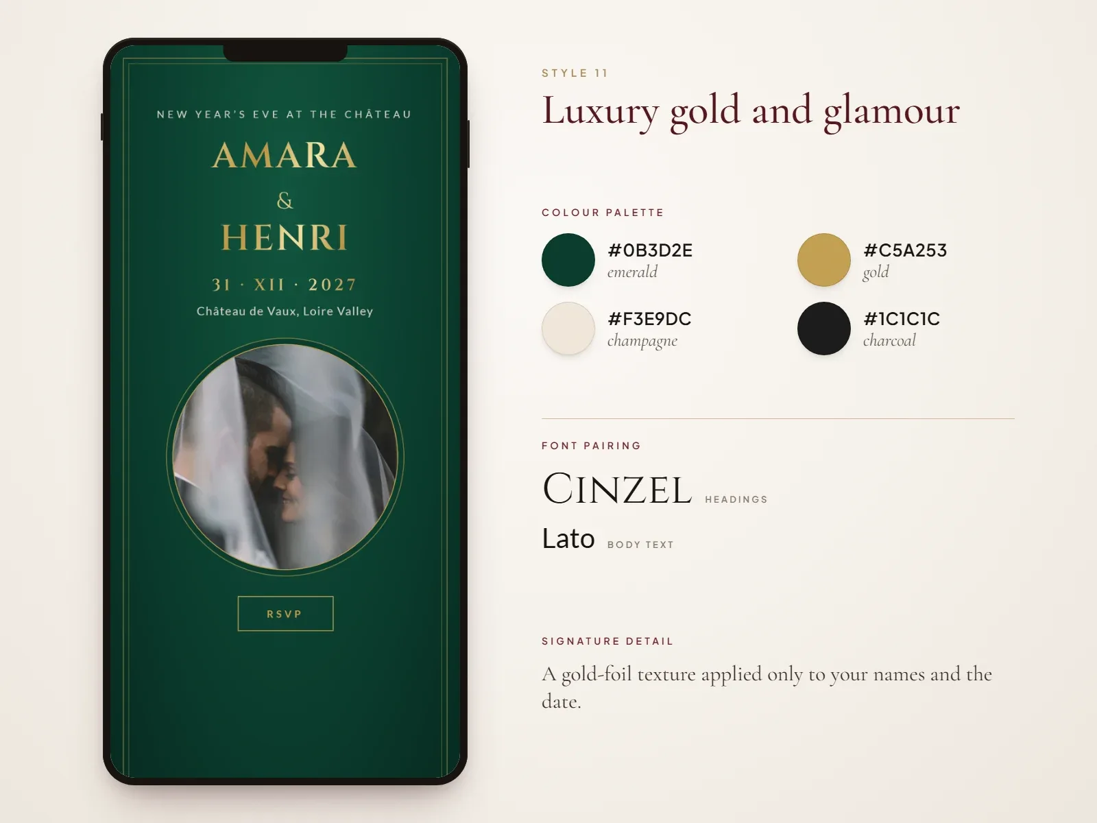
Glamorous wedding websites feel like an evening gown: deep jewel tones, gold-foil effects and fine lines. Use gold for accents only, never for long paragraphs, because it is hard to read on screen.
- Best for: hotel ballrooms, châteaux, winter and New Year’s Eve weddings.
- Colour palette: #0B3D2E (emerald), #C5A253 (gold), #F3E9DC (champagne), #1C1C1C (charcoal).
- Font pairing: Cinzel for headings, Lato for body text.
- Signature detail: a gold-foil texture applied only to your names and the date.
- Try it: luxury wedding templates.
12. Editorial magazine layout
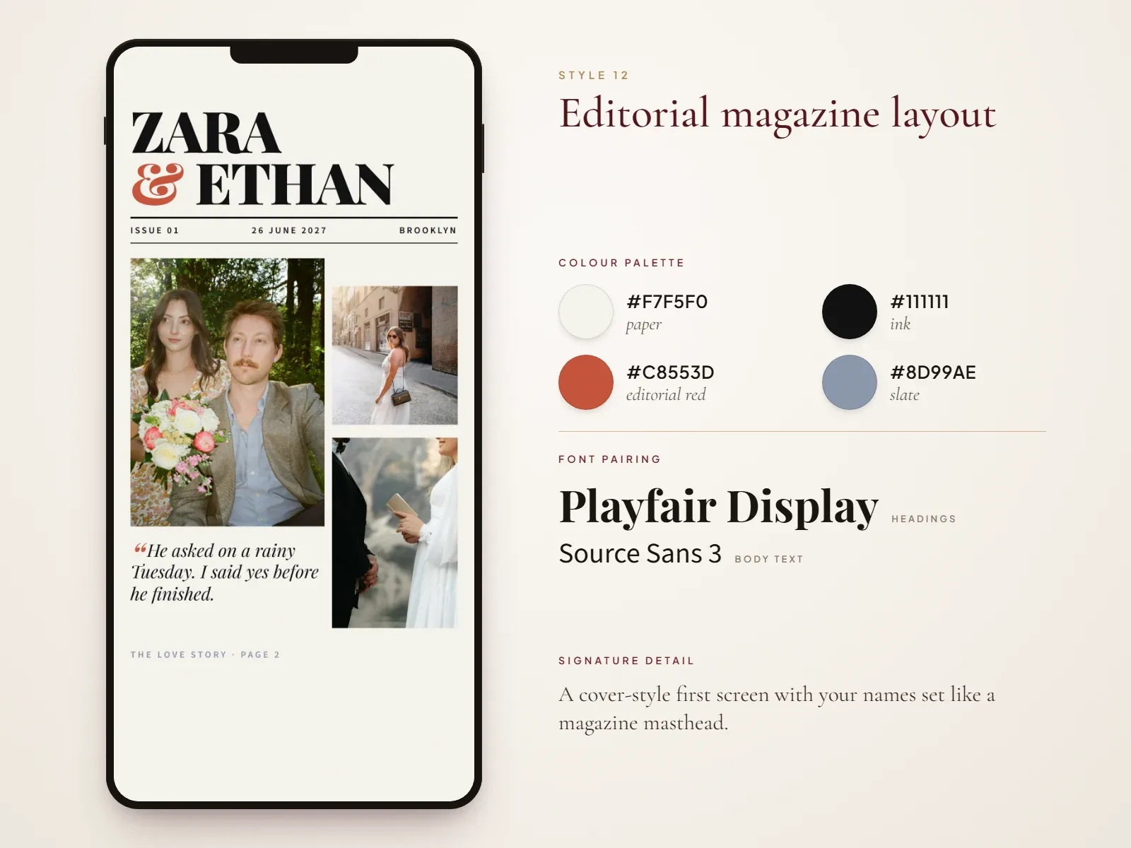
Editorial designs treat your wedding like a magazine feature: an oversized headline, asymmetric photo grids and pull quotes from your love story. They are a great fit if your engagement shoot gave you plenty of strong images.
- Best for: fashion-forward couples and creative professionals.
- Colour palette: #F7F5F0 (paper), #111111 (ink), #C8553D (editorial red), #8D99AE (slate).
- Font pairing: Playfair Display for headings, Source Sans 3 for body text.
- Signature detail: a cover-style first screen with your names set like a magazine masthead.
- Try it: modern wedding templates.
13. Whimsical watercolour and illustrated
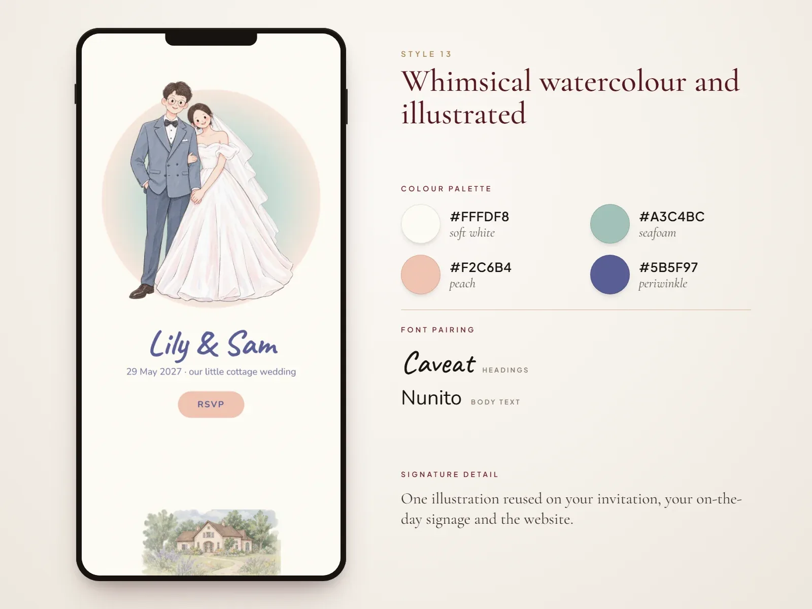
Illustrated wedding websites replace or mix photos with custom artwork: a watercolour portrait of the two of you, your venue sketched in ink, or your dog as ring bearer. It is the most personal style on this list.
- Best for: playful couples, intimate weddings and couples without engagement photos.
- Colour palette: #FFFDF8 (soft white), #A3C4BC (seafoam), #F2C6B4 (peach), #5B5F97 (periwinkle).
- Font pairing: Caveat for headings, Nunito for body text.
- Signature detail: one illustration reused on your invitation, your on-the-day signage and the website.
14. Bold colour and maximalist
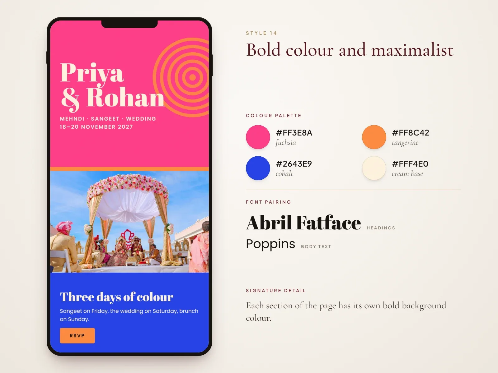
Maximalist wedding websites are loud and joyful: colour blocking, oversized type, playful patterns and plenty of personality. Keep them usable with clear contrast between text and background on every block.
- Best for: colourful cultural celebrations and party-first weddings.
- Colour palette: #FF3E8A (fuchsia), #FF8C42 (tangerine), #2643E9 (cobalt), #FFF4E0 (cream base).
- Font pairing: Abril Fatface for headings, Poppins for body text.
- Signature detail: each section of the page has its own bold background colour.
15. One-page scroll
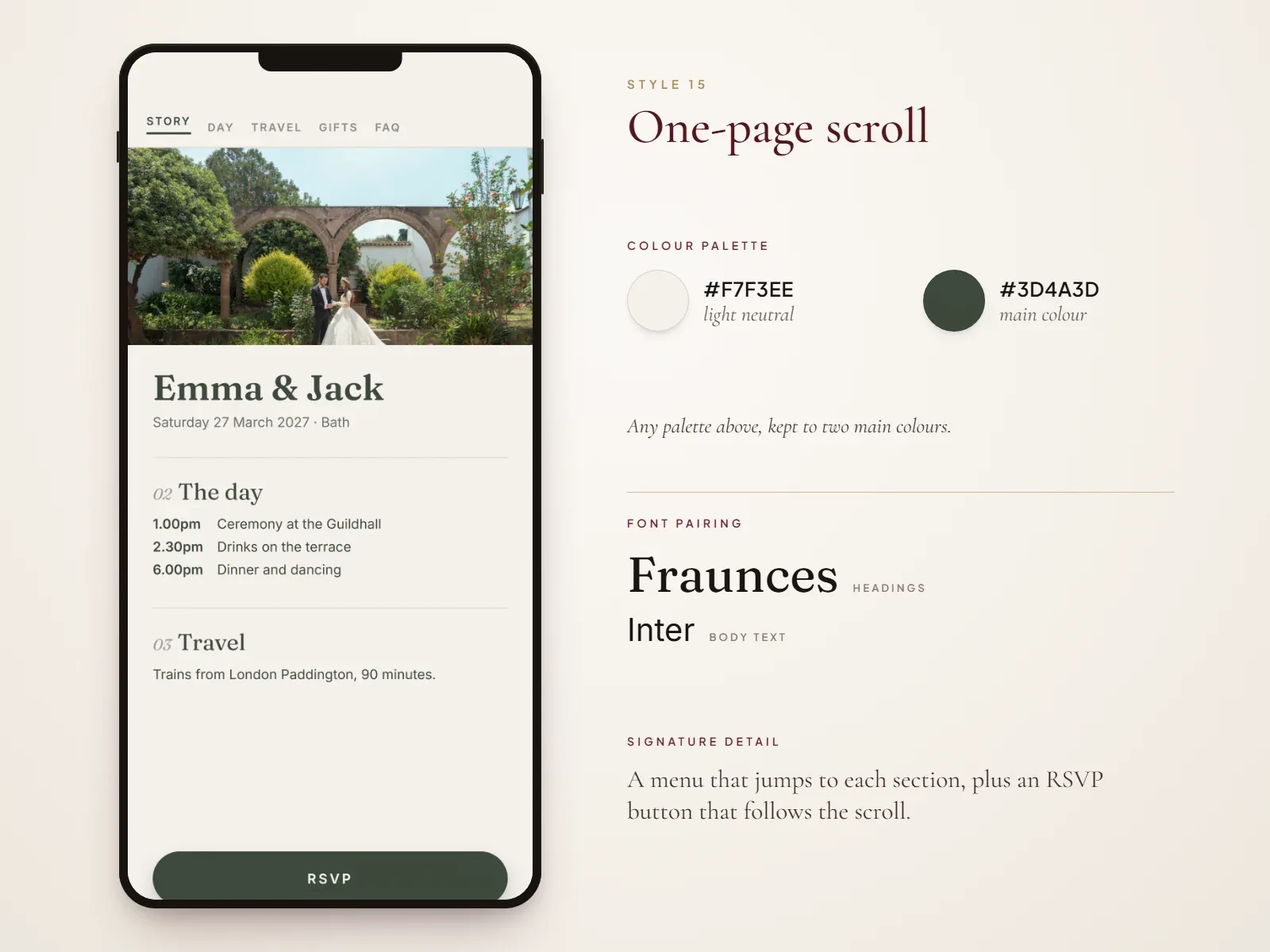
A one-page wedding website puts everything, from your story and schedule to travel, gifts and the RSVP, on a single scrolling page with a menu that stays in view. It is the quickest style to build and the easiest for guests to use on a phone, which makes it ideal for intimate or short-notice weddings.
- Best for: small weddings, elopements and tight timelines.
- Colour palette: any palette above, kept to two main colours so the long page feels unified.
- Font pairing: Fraunces for headings, Inter for body text.
- Signature detail: a menu that jumps to each section, plus an RSVP button that follows the scroll.
Which wedding website style fits your wedding?
Not sure where to start? Match your venue and season to a style using the table below.
| Style | Best for | Season | Mood | Effort to set up |
|---|---|---|---|---|
| Minimalist and modern | City, loft, register office | Any | Clean, calm | Easy |
| Classic and elegant | Church, country house | Any | Timeless, formal | Easy |
| Romantic floral | Garden, estate | Spring, summer | Soft, romantic | Medium |
| Garden and botanical | Vineyard, orangery | Spring, summer | Fresh, organic | Medium |
| Boho chic | Festival, back garden | Summer, autumn | Relaxed, warm | Medium |
| Rustic barn | Barn, farm | Autumn | Cosy, homely | Medium |
| Tropical and beach | Beach, island | Summer | Bright, breezy | Easy |
| Destination travel hub | Weddings abroad | Any | Practical, adventurous | More work |
| Vintage and retro | Historic venues | Any | Nostalgic | Medium |
| Black and white | Formal city venues | Any | Editorial, timeless | Easy |
| Luxury gold and glamour | Hotel ballroom, château | Winter, New Year’s Eve | Opulent | Medium |
| Editorial magazine | Creative couples | Any | Fashion-forward | More work |
| Watercolour and illustrated | Intimate, playful weddings | Any | Whimsical, personal | More work (needs an artist) |
| Bold colour and maximalist | Cultural, party-first | Any | Joyful, loud | Medium |
| One-page scroll | Small weddings, elopements | Any | Simple, efficient | Easy |
How to choose colours and fonts for your wedding website
The quickest way to make any of these styles look polished is to limit your choices. Here is a simple system:
- Start from what already exists. Pull colours from your invitation, bridesmaid dresses, flowers or venue. If you have not settled on a palette yet, create a wedding mood board first.
- Use the 60-30-10 rule. 60% background colour (usually a light neutral), 30% secondary colour for headings and section backgrounds, and 10% accent for buttons and links.
- Pick two fonts, not four. One display font for names and headings, one simple serif or sans-serif for body text. Keep script fonts for short words like your names, never for paragraphs or timings.
- Check contrast. Dark text on a light background is easiest to read. Avoid pale pink on white or gold on beige, especially for addresses and times.
- Repeat one motif. A monogram, a leaf, a wave or an arch, used at the top of the page and between sections, makes the whole site feel intentional.
Phone-first design tips most couples miss
Most guests open a wedding website from a WhatsApp message, text or email, which means on a phone. A design that looks stunning on a laptop can be frustrating on a six-inch screen. Before you share the link, check these:
- Keep the RSVP within thumb reach. A button that stays at the bottom of the screen, or one repeated at the end of each section, works best. Aurelia’s online RSVP collects party size, dietary needs and song requests in one short form.
- Compress your photos. Aim for images under roughly 300 KB each so the site loads quickly on mobile data at the venue.
- Set body text to at least 16px. Older relatives will thank you, and so will anyone reading in bright sunshine.
- Avoid text on busy photos. If your names sit over an image, add a dark overlay so they stay readable.
- Make addresses and phone numbers tappable. Link the venue to a map and phone numbers to the dialler.
- Test on both iPhone and Android, and ask one or two friends to send a test RSVP before you share the link with everyone.
Common wedding website design mistakes
- Too many fonts and colours. Three fonts and six colours make even beautiful photos look messy. Stick to two fonts and one palette.
- Hiding the key details. The date, place and RSVP deadline belong on the first screen, not further down.
- Leaving out travel and accommodation. Guests need parking, transport times, hotel blocks and booking deadlines, especially when you are inviting overseas guests.
- Broken gift list or RSVP links. Tap every button yourself after each change.
- Forgetting the passcode. If you protect your site, put the passcode on your invitation so guests are not locked out.
Bring your wedding website design ideas to life
The best wedding website feels like the two of you and makes life easy for your guests. Choose the style that suits your venue and season, borrow its palette and fonts, then focus on clear details and an RSVP that is easy to send from a phone. With the right template, you can go from inspiration to a live site in a single weekend: start with a template and personalise the colours and wording, then share your invitation, website and RSVP in one link.
- What should be on a wedding website?
- Your names and wedding date, ceremony and reception venues, a schedule for the day, travel and accommodation, your gift list, an RSVP form and an FAQ for guests. Many couples also add their story and a photo gallery. See the full wedding website checklist.
- When should you launch your wedding website?
- Before you send save the dates, usually six to eight months before the wedding, or nine to twelve months ahead for a destination wedding, so the link can go on your save the dates. More on when to create a wedding website.
- What should I write in the “Our story” section?
- Keep it short, around 150 to 300 words, and specific: how you met, a memorable moment together and how the proposal happened. Writing it together, or each telling one part, makes it more personal for guests to read.
- Should a wedding website be password protected?
- A passcode is a good idea if your site shows home addresses, children’s names or the guest list, or if you are planning a small private wedding. Keep it simple, such as your wedding date, and include it on your invitation. Aurelia’s Bespoke plan includes guest passcode privacy.
- Can I match my wedding website to my invitations?
- Yes, and it is the easiest way to make the design feel cohesive: use the same colours, fonts and motif. With Aurelia, your digital wedding invitation and wedding website share one design and one link.